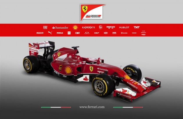
Ferrari has revealed its iteration of the 2014 Formula One vehicle layout which imposes new rules for teams, resulting in some strange new front end designs.
For this year’s season, the FIA has imposed aero rules that effectively cause teams to lower the nose of their cars. Teams were asked to do this in 2013, resulting in a step layout, but now it is even lower.
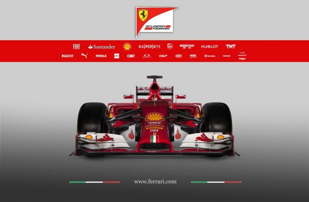
As you can see, it leaves for a rather ugly layout. The 2014 F14-T, as it’s called, features a large elephant-like trunk which slowly flows downwards into the front wing. At the very tip is an open ‘snout’. We’re sure you’ll agree, it looks quite hideous.
Critics are becoming very frustrated with the FIA as it introduces more and more rules. Other teams are using a snout-like design which goes pointy at the tip, looking similarly ugly.
Other than the awkward nose, the 2014 Ferrari F1 car incorporates a lot more black on it this year. It also uses a new turbocharged V6 engine as per FIA regulations.
Feel free to tell us what you think of it in the comments section below.


looks like my vacuum cleaner hahaha