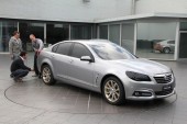
If you ever get a chance to take a tour of Holden’s design studio in Melbourne, be sure not to pass up the opportunity. The studio is the home of Holden’s new VF Commodore, unveiled last Sunday, and is one of just three dedicated GM design studios in the world.
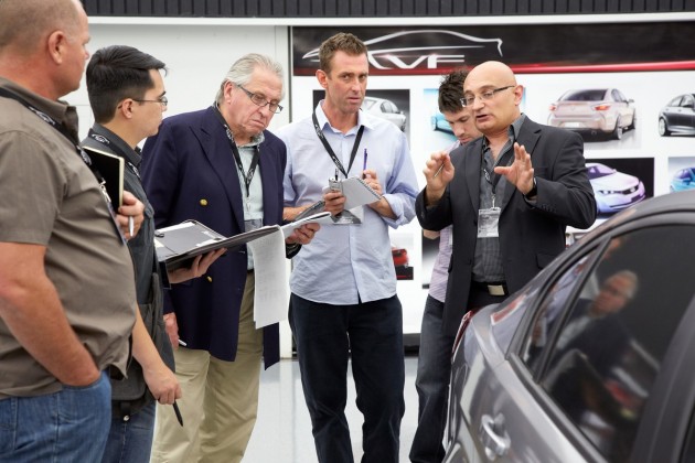
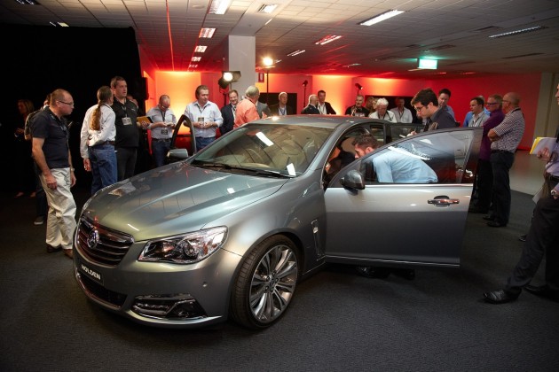
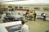
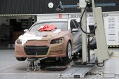
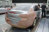
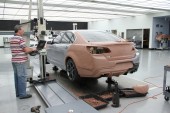
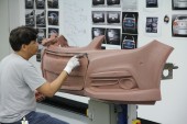
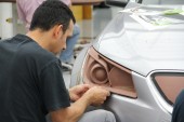
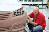
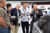
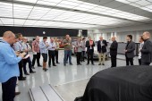
During the unveiling of the new Commodore, Holden invited a selection of motoring journalists to see how cars like the VF are created, gaining us access to the high security facility. Unfortunately, we weren’t allowed to take photos, but the company did provide us with a handful of snaps from the day.
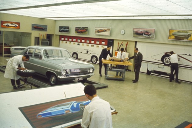
This building has been extremely important for the Aussie car industry over the past years. In fact, every Holden ever made since 1964 has been born within these walls.
Not only are our local Holdens designed here though, loads of other GM-owned brands and models are created from within the Docklands building.
It’s all run by only a handful of faculties, which have a handful of employees each. They come up with the exterior and interior design, while electronics gurus work, in close relationship with the designers, to work in the latest equipment and features.
Car designing starts with a design brief, a kind of ‘must-have’ criteria which is determined by the directors of each area. The directors take on plenty of customer feedback in coming up with the ‘criteria’ of what the car must have.
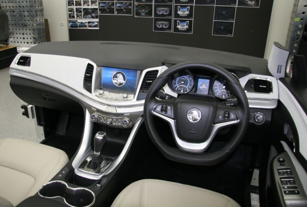
From there, members of each team pitch an idea. In the VF Commodore’s case, three designs were pitched for the interior layout. According to the brief, three main aspects were a must. Directors wanted something that was “much more dynamic” with an improved “quality perception” and user friendliness over the VE.
In the end, one design was chosen. It shared all three criteria. We saw all three of the pitches, which were displayed on the studio walls, and it was amazing to see how similar they all were despite being conjured up separately by three people.
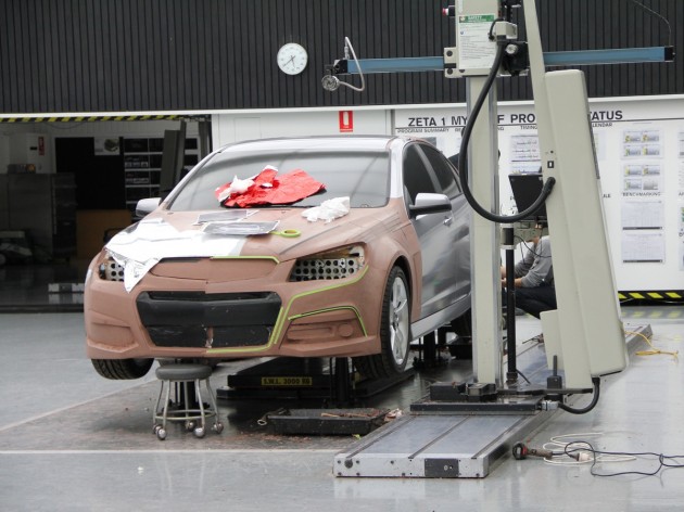
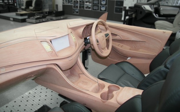
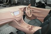
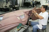
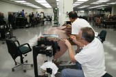
Once the ideal design is decided, a full scale model is created out of clay, which is painstakingly carved into form for executives and directors to finally approve. The clay models look exactly like the real thing, although, plastics and trimmings are implanted onto the surface (below).
It might not seem like it but so much attention to detail goes into creating a new model. For the VF, a dedicated unit concentrated specifically on the computer programs used to help design the car. That’s like having a small team solely working on sorting out the best pens and pencils that could be used. Well, it’s a lot more advanced than that but you get what we mean.
For each design, the teams had to take into account the comfort, style, useability, and the cost and availability of the materials that would be used – there’s no point in creating a super-comfortable seat trim out of whale skin when thousands of mass-market seats have to be produced, in other words.
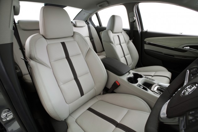
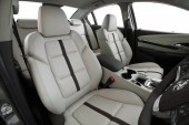
The seats in the VF feature a central stripe down the middle which gives the interior contrast and falls in line with the designer’s aim to create a light multi-tone decor. They match the door trims and the dash too.
The seats themselves are formed with great thought and customer feedback in mind. The designers eventually came up with a comfort level cushion for the VF seat and a sport level cushion for the seat back.
The result is a seat that should be comfortable for long journeys and one that is also supportive for more active driving stints.
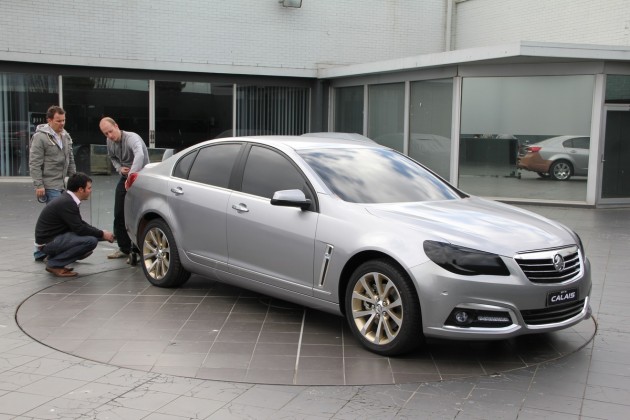
As for the exterior, it has taken a clear step towards prestige and more premium feel compared with the outgoing VE. Andrew Smith, Holden director of design, said at the special event that the VF was created to “increase the drama” of the otherwise regular family sedan. He hoped the design would exceed the expectations of the buyers.
Upon initial inspection, you can clearly see that it is going for a much more up market character. The rear is lengthened for an elegant stance, while the front end is fuller, with heaps more presence.
Although the centre cabin structure, including the doors and roof, are identical the those on the VE, Holden has managed to come up with something that is certainly fresh and more vibrant. It would have been nice to see new doors. The VE items do seem to blend in rather well though.
When asked about using the existing cabin and doors, Richard Ferlazzo, Holden chief designer, said during the presentations, “If we could change the cabin, we would. Do we need to? No.”
He said that although the doors and roof have been carried across, their contours were very suitable for the rest of the VF body.
During the presentation, we were also given a first-look at the VF Commodore SS V, and boy does it look good. There’s an aggressive finned diffuser at the back, a neat lip spoiler on the boot, quad-outlet exhausts, and a noticeably beefed-up bodykit. There’s also 19-inch alloy wheels hiding Brembo brakes.
The new VF SS will be revealed tomorrow. We’ll be sure to bring you images and details in a separate story the moment they are released.
UPDATE: 2014 Holden VF Commodore SS V revealed.
